
Statistics Gcse Edexcel Higher
-
Planning-And-Types-Of-Data gcse Edexcel Higher2 主题
-
Population-Sampling-And-Collecting-Data gcse Edexcel Higher2 主题
-
Tabulation-Diagrams-And-Representation gcse Edexcel Higher10 主题
-
Bar-Charts-Line-Graphs-And-Pictograms gcse Edexcel
-
Pie-Charts gcse Edexcel
-
Stem-And-Leaf-Diagrams gcse Edexcel
-
Two-Way-Tables-And-Venn-Diagrams gcse Edexcel
-
Population-Pyramids gcse Edexcel
-
Choropleth-Maps gcse Edexcel
-
Cumulative-Frequency-Charts gcse Edexcel
-
Box-Plots gcse Edexcel
-
Histograms-And-Frequency-Polygons gcse Edexcel
-
Selecting-And-Interpreting-Data-Representations gcse Edexcel
-
Bar-Charts-Line-Graphs-And-Pictograms gcse Edexcel
-
Measures-Of-Central-Tendency gcse Edexcel Higher5 主题
-
Measures-Of-Dispersion gcse Edexcel Higher4 主题
-
Using-Summary-Statistics gcse Edexcel Higher3 主题
-
Index-Numbers-And-Rates-Of-Change gcse Edexcel Higher2 主题
-
Scatter-Diagrams-And-Correlation gcse Edexcel Higher4 主题
-
Time-Series gcse Edexcel Higher3 主题
-
Quality-Assurance-And-Estimation gcse Edexcel Higher2 主题
-
Probability-Basics gcse Edexcel Higher4 主题
-
Probability-Distributions gcse Edexcel Higher2 主题
Pie-Charts gcse Edexcel
Exam code:1ST0
Pie Charts
What is a pie chart?
-
A pie chart is a circle which is divided into slices (sectors) to show proportions
-
They show the relative size of categories of data compared to each other
-
rather than their actual size or number
-
e.g. looking at the proportions of men and women working for a company, we might be more interested in the relative sizes of the groups than in the actual numbers of men and women
-
-
-
There are 360° in a circle
-
We can use this to help us calculate the size of each slice of the pie chart
-
How do I draw a pie chart?
-
This is shown easiest through an example
-
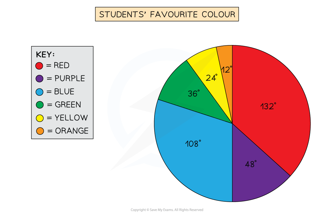
The following data is collected for a class of 30 students about their favourite colour
|
Colour |
Red |
Purple |
Blue |
Green |
Yellow |
Orange |
|
Students |
11 |
4 |
9 |
3 |
2 |
1 |
-
STEP 1
Find the number of degrees that represents 1 student-
There are 30 students in total, so 360° = 30 students
-
Divide both sides by 30, so 12° = 1 student
-
-
STEP 2
Calculate the angle for each category by finding a fraction of 360°-
11 students out of 30 said red was their favourite colour,
-
so this is
format('truetype')%3Bfont-weight%3Anormal%3Bfont-style%3Anormal%3B%7D%3C%2Fstyle%3E%3C%2Fdefs%3E%3Cline%20stroke%3D%22%23000000%22%20stroke-linecap%3D%22square%22%20stroke-width%3D%221%22%20x1%3D%222.5%22%20x2%3D%2223.5%22%20y1%3D%2223.5%22%20y2%3D%2223.5%22%2F%3E%3Ctext%20font-family%3D%22Times%20New%20Roman%22%20font-size%3D%2218%22%20text-anchor%3D%22middle%22%20x%3D%2213.5%22%20y%3D%2216%22%3E11%3C%2Ftext%3E%3Ctext%20font-family%3D%22Times%20New%20Roman%22%20font-size%3D%2218%22%20text-anchor%3D%22middle%22%20x%3D%2213.5%22%20y%3D%2241%22%3E30%3C%2Ftext%3E%3Ctext%20font-family%3D%22math1c604c3ec9076705ed0c8041ca6%22%20font-size%3D%2216%22%20text-anchor%3D%22middle%22%20x%3D%2234.5%22%20y%3D%2230%22%3E%26%23xD7%3B%3C%2Ftext%3E%3Ctext%20font-family%3D%22Times%20New%20Roman%22%20font-size%3D%2218%22%20text-anchor%3D%22middle%22%20x%3D%2256.5%22%20y%3D%2230%22%3E360%3C%2Ftext%3E%3Ctext%20font-family%3D%22math1c604c3ec9076705ed0c8041ca6%22%20font-size%3D%2216%22%20text-anchor%3D%22middle%22%20x%3D%2274.5%22%20y%3D%2230%22%3E%26%23xB0%3B%3C%2Ftext%3E%3Ctext%20font-family%3D%22math1c604c3ec9076705ed0c8041ca6%22%20font-size%3D%2216%22%20text-anchor%3D%22middle%22%20x%3D%2286.5%22%20y%3D%2230%22%3E%3D%3C%2Ftext%3E%3Ctext%20font-family%3D%22Times%20New%20Roman%22%20font-size%3D%2218%22%20text-anchor%3D%22middle%22%20x%3D%22108.5%22%20y%3D%2230%22%3E132%3C%2Ftext%3E%3Ctext%20font-family%3D%22math1c604c3ec9076705ed0c8041ca6%22%20font-size%3D%2216%22%20text-anchor%3D%22middle%22%20x%3D%22126.5%22%20y%3D%2230%22%3E%26%23xB0%3B%3C%2Ftext%3E%3C%2Fsvg%3E)
-
-
4 students out of 30 said purple,
-
so this is
format('truetype')%3Bfont-weight%3Anormal%3Bfont-style%3Anormal%3B%7D%3C%2Fstyle%3E%3C%2Fdefs%3E%3Cline%20stroke%3D%22%23000000%22%20stroke-linecap%3D%22square%22%20stroke-width%3D%221%22%20x1%3D%222.5%22%20x2%3D%2223.5%22%20y1%3D%2223.5%22%20y2%3D%2223.5%22%2F%3E%3Ctext%20font-family%3D%22Times%20New%20Roman%22%20font-size%3D%2218%22%20text-anchor%3D%22middle%22%20x%3D%2213.5%22%20y%3D%2216%22%3E4%3C%2Ftext%3E%3Ctext%20font-family%3D%22Times%20New%20Roman%22%20font-size%3D%2218%22%20text-anchor%3D%22middle%22%20x%3D%2213.5%22%20y%3D%2241%22%3E30%3C%2Ftext%3E%3Ctext%20font-family%3D%22math1c604c3ec9076705ed0c8041ca6%22%20font-size%3D%2216%22%20text-anchor%3D%22middle%22%20x%3D%2234.5%22%20y%3D%2230%22%3E%26%23xD7%3B%3C%2Ftext%3E%3Ctext%20font-family%3D%22Times%20New%20Roman%22%20font-size%3D%2218%22%20text-anchor%3D%22middle%22%20x%3D%2256.5%22%20y%3D%2230%22%3E360%3C%2Ftext%3E%3Ctext%20font-family%3D%22math1c604c3ec9076705ed0c8041ca6%22%20font-size%3D%2216%22%20text-anchor%3D%22middle%22%20x%3D%2274.5%22%20y%3D%2230%22%3E%26%23xB0%3B%3C%2Ftext%3E%3Ctext%20font-family%3D%22math1c604c3ec9076705ed0c8041ca6%22%20font-size%3D%2216%22%20text-anchor%3D%22middle%22%20x%3D%2286.5%22%20y%3D%2230%22%3E%3D%3C%2Ftext%3E%3Ctext%20font-family%3D%22Times%20New%20Roman%22%20font-size%3D%2218%22%20text-anchor%3D%22middle%22%20x%3D%22104.5%22%20y%3D%2230%22%3E48%3C%2Ftext%3E%3Ctext%20font-family%3D%22math1c604c3ec9076705ed0c8041ca6%22%20font-size%3D%2216%22%20text-anchor%3D%22middle%22%20x%3D%22117.5%22%20y%3D%2230%22%3E%26%23xB0%3B%3C%2Ftext%3E%3C%2Fsvg%3E)
-
-
Repeat this for each category, they should sum to 360° in total
-
|
Colour |
Red |
Purple |
Blue |
Green |
Yellow |
Orange |
|
Students |
11 |
4 |
9 |
3 |
2 |
1 |
|
Angle |
132° |
48° |
108° |
36° |
24° |
12° |
-
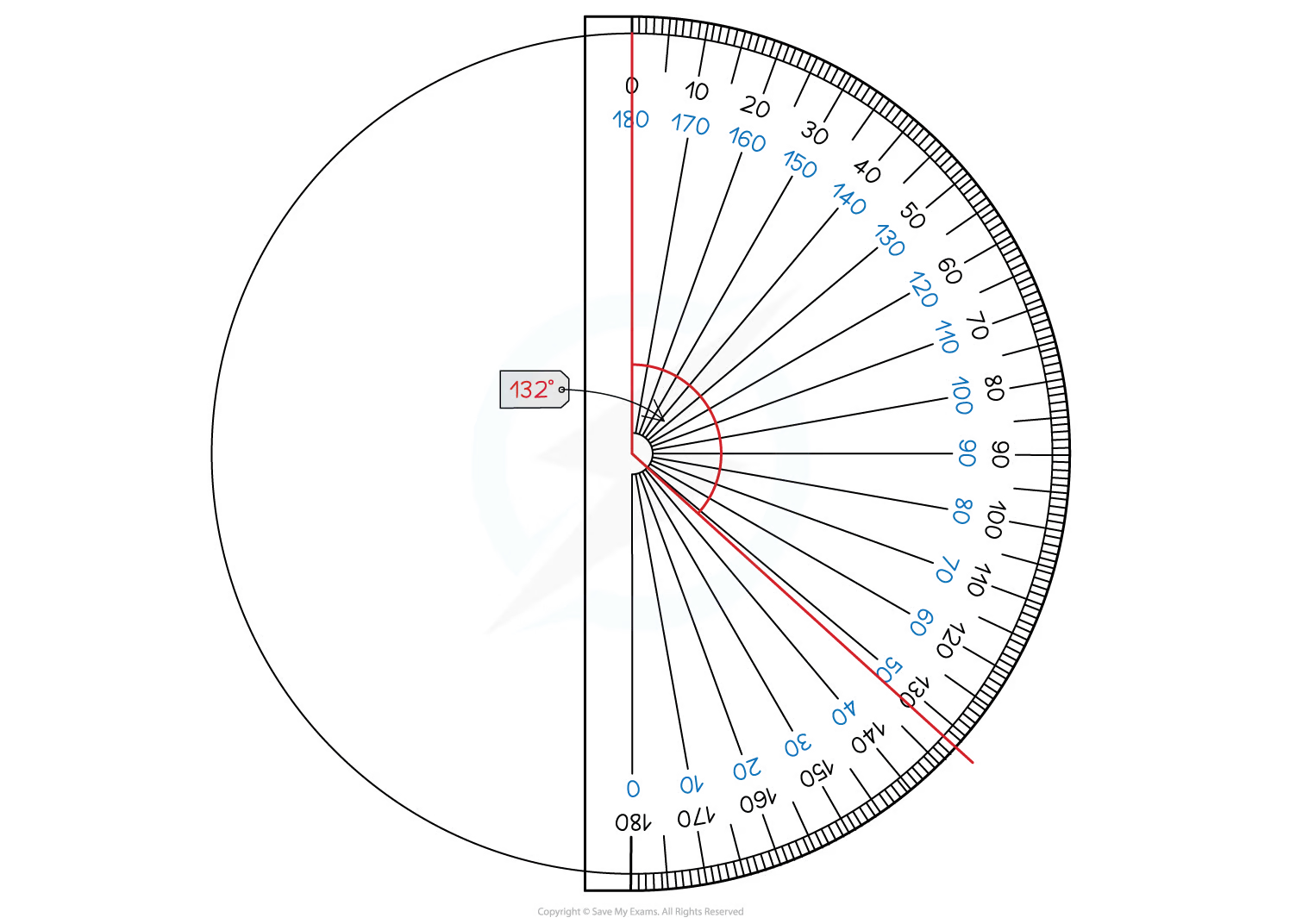
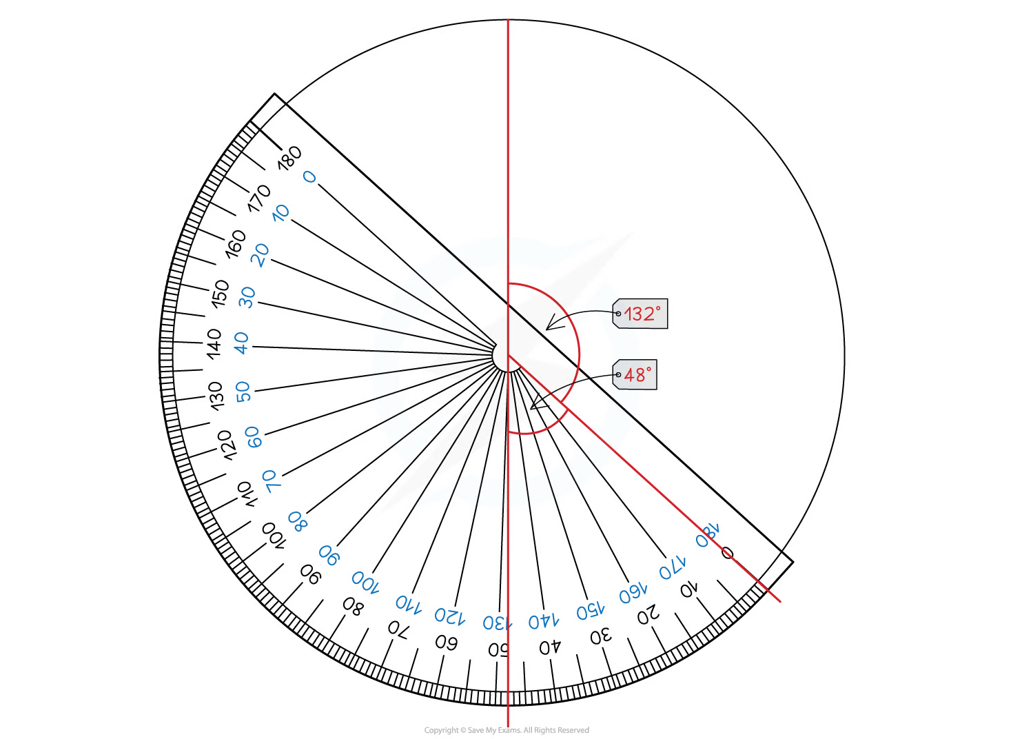
STEP 3
Draw the pie chart, using a protractor to measure the angles-
Start by drawing a vertical line from the centre of the circle to the top (“12 o’clock”)
-
Then use your protractor to measure the first angle and draw a line to this point
-
Move your protractor to this line, and repeat for the next category
-
Continue until the slices for all the categories are drawn
-
You should include a key or labels to show which slice represents which category
-
How do I interpret a pie chart or find missing information?
-
It is easy to spot from a pie chart which category is the largest or smallest proportion
-
But you may be asked to do something more advanced like finding some
-
Responses