
Exam code:1ST0
Bar Charts & Vertical Line Graphs
What is a bar chart?
-
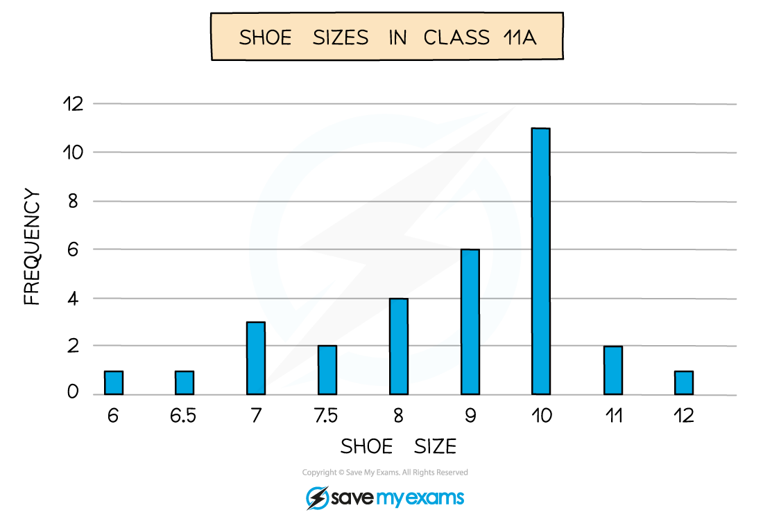
A bar chart is a visual way to represent discrete data
-
Discrete data is data that can be counted
-
This can be numerical like shoe sizes in a class
-
Or non-numerical (categorical) like colours of cars down a road
-
-
-
The horizontal axis shows the different outcomes
-
The vertical axis shows the frequency
-
The heights of the bars show the frequency
-
Bars should be separated by gaps
-
Bars should have equal widths
-
What is a dual (comparative) bar chart?
-
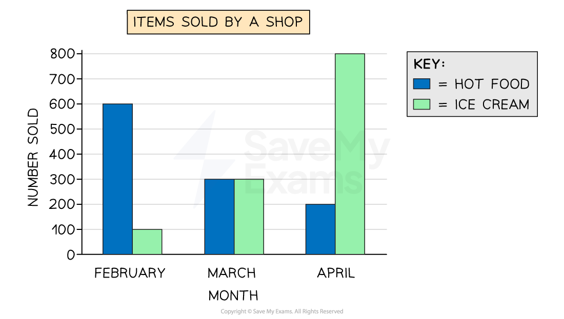
Dual (or comparative) bar charts compare two data sets on one bar chart
-
The data sets measure the same variable, so use the same scale
-
The bars are in pairs (side-by-side) for each outcome
-
e.g. For comparing the shoe sizes of two year groups
-
What is a bar-line chart?
-
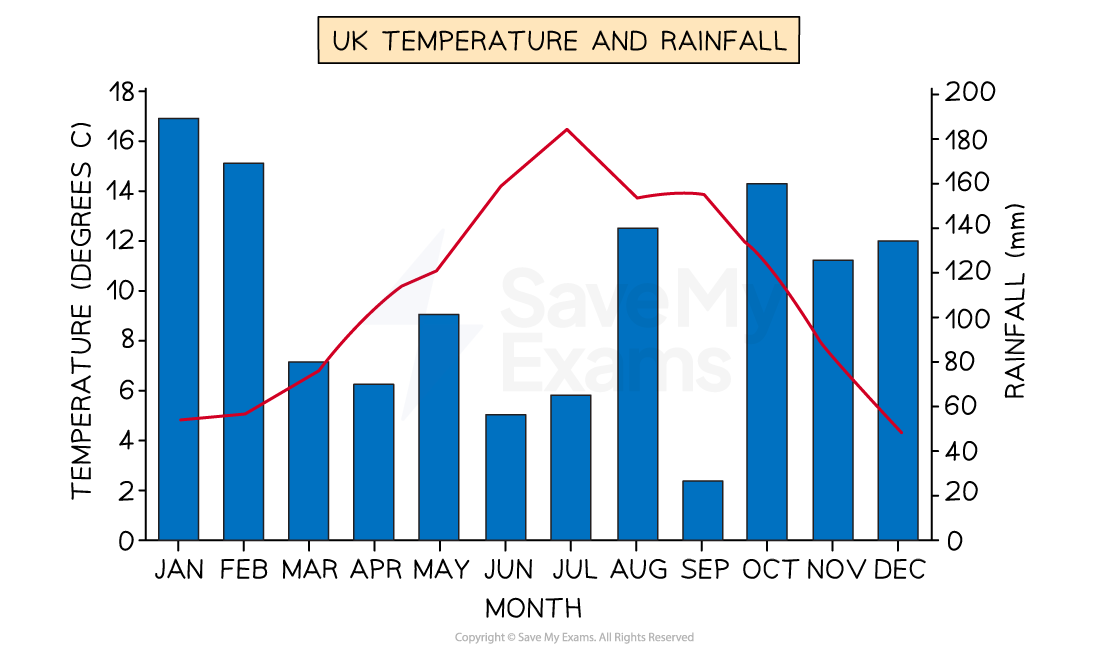
A bar-line chart also shows two data sets on one chart
-
However one data set is represented by a line, and the other by bars
-
This allows two different variables to be shown, with a different scale for each
-
e.g. For showing the monthly temperature (as a line) and the monthly rainfall (as bars) across the year for a location
-
One scale would be in °C, and the other would be in mm
-
-
-
There are also composite bar charts, which are covered in their own section below
What is a vertical line graph?
-
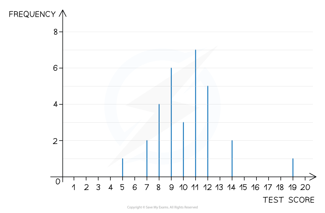
A vertical line graph (or vertical line chart), is a visual way to represent discrete data
-
Vertical line graphs are used for numerical data (rather than categorical data)
-
They are particularly useful when there are lots of different options to show
e.g. Results of a test where scores are given as percentages
-
-
Do not confuse these with the line graphs which are used when drawing time series graphs
-
For those, see the ‘Time Series Graphs’ revision note
-
-
-
The vertical axis shows the frequency
-
The horizontal axis shows the different outcomes
-
You can easily identify the mode (most common value) using a line chart
-
This will be the outcome with the highest (tallest/longest) line
-
e.g. In the line chart above, 11 was the modal test score, with a frequency of 7
-
-
You can quickly see how the data is spread using a line chart
-
Lines may be crowded around a particular group of options
-
This may help identify anomalies or outliers in the data
-
e.g. In the line chart above you can see
-
the majority of the test scores, out of 20, were between 7 and 12
-
one pupil scored 19 out of 20, much higher than anyone else in the class
-
-
Examiner Tips and Tricks
-
If asked to draw a bar chart, find the largest frequency and select a scale which allows it to fit in the space provided
Worked Example
Mr Barr teaches students in Year 7 and Year 8.
He records the number of pets that students in each year have.
His results are shown in the dual bar chart below.
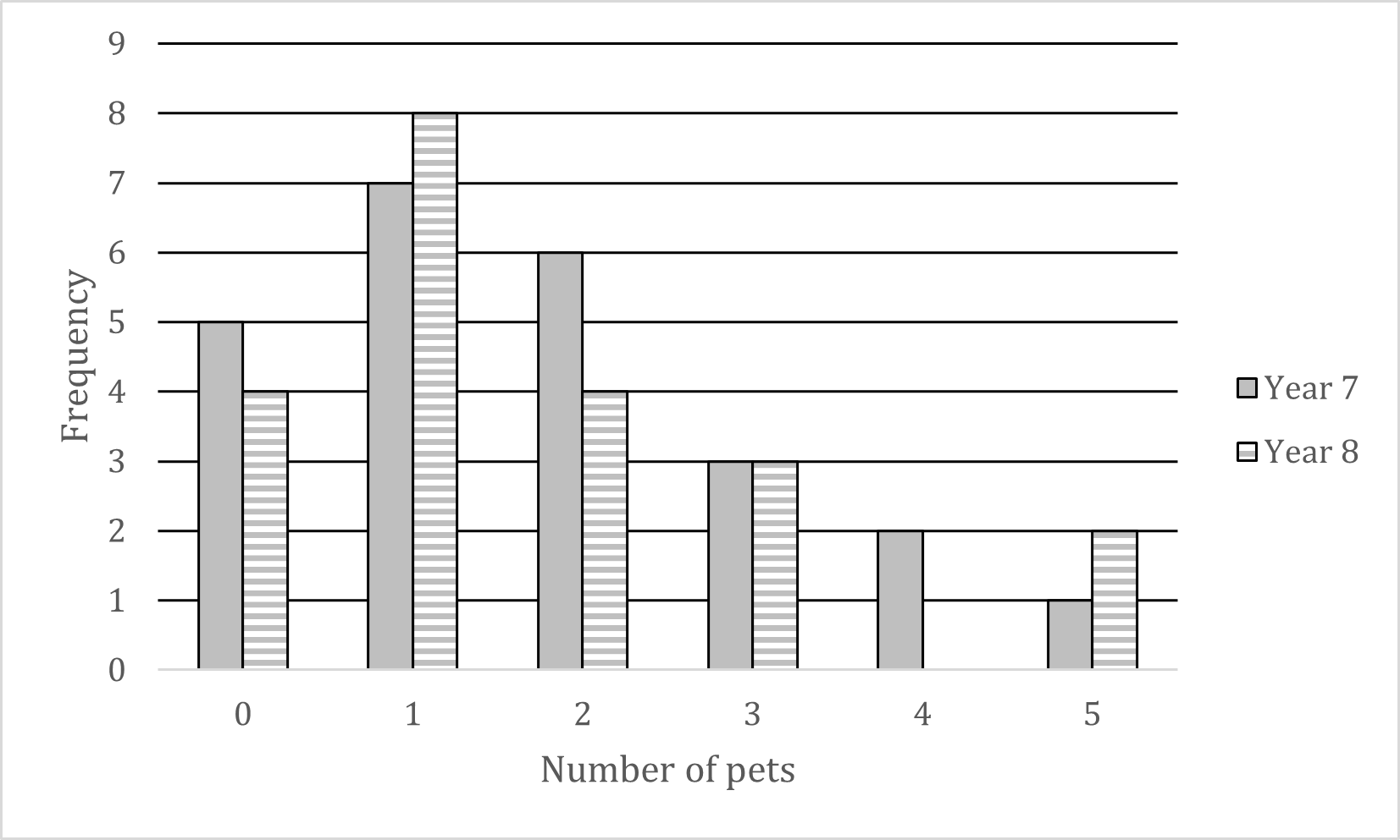
(a) Write down the modal number of pets for his Year 7 students.
The modal number (mode) is the number of pets that occurs the most
Visually, this will be the highest bar for Year 7s
The mode for Year 7 is 1 pet
(b) How many Year 8 students does he teach?
Add up all the heights (frequencies) of the Year 8 bars
4 + 8 + 4 + 3 + 0 + 2 = 21
He teaches 21 Year 8 students
Pictograms
What is a pictogram?
-
A pictogram is an alternative to a bar chart
-
It is used in the same situations
-
-
There are no axes
-
Frequency is represented by symbols
-
A key shows the value of 1 symbol
-
For example, 1 symbol represents a frequency of 2
-
-
Half and quarter symbols are often used
-
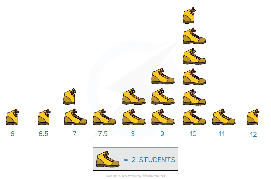
-
The pictogram above shows the shoe sizes of students in a class
-
As 1 picture of a shoe represents 2 students
-
Half a shoe represents 1 student
-
-
The number of students with a shoe size of 7, is 3
-
Composite Bar Charts
What is a composite bar chart?
-
A composite bar chart shows the total frequency for a category as well as the proportions in each category
-
For example, the chart below shows the total number of vehicles passing a location at different times
-
The overall height of each bar shows the total number of vehicles
-
The sections within each bar show the proportion of vehicles by type
-
Be careful – it is just the height of each coloured section which shows the frequency, not the whole bar
-
e.g. For 9-9:30 am, there are around 10 bikes, not 80
-
-
-
Composite bar charts can reveal more information that a regular bar chart
-
e.g. The below chart shows the least traffic in total is between 9:30-10 am, but it is also during this time that the greatest number of lorries are present
<img alt=”Composite bar chart for traffic counts by type and time” class=”ContentBlock_figure__vJw2q” data-nimg=”1″ decoding=”async” height=”623″ loading=”lazy” sizes=”(max-width: 320px) 320w, (max-width: 640px) 640w, (max-width: 960px) 960w, (max-width: 1280px) 1280w, 1920w” src=”https://cdn.savemyexams.com/cdn-cgi/image/f=auto,width=3840/https://cdn.savemyexams.com/uploads/2022/08/compound-bar-chart.png” srcset=”https://cdn.savemyexams.com/cdn-cgi/image/f=auto,width=16/https://cdn.savemyexams.com/uploads/2022/08/compound-bar-chart.png 16w, https://cdn.savemyexams.com/cdn-cgi/image/f=auto,width=32/https://cdn.savemyexams.com/uploads/2022/08/compound-bar-chart.png 32w, https://cdn.savemyexams.com/cdn-cgi/image/f=auto,width=48/https://cdn.savemyexams.com/uploads/2022/08/compound-bar-chart.png 48w, https://cdn.savemyexams.com/cdn-cgi/image/f=auto,width=64/https://cdn.savemyexams.com/uploads/2022/08/compound-bar-chart.png 64w, https://cdn.savemyexams.com/cdn-cgi/image/f=auto,width=96/https://cdn.savemyexams.com/uploads/2022/08/compound-bar-chart.png 96w, https://cdn.savemyexams.com/cdn-cgi/image/f=auto,width=128/https://cdn.savemyexams.com/uploads/2022/08/compound-bar-chart.png 128w, https://cdn.savemyexams.com/cdn-cgi/image/f=auto,width=256/https://cdn.savemyexams.com/uploads/2022/08/compound-bar-chart.png 256w, https://cdn.savemyexams.com/cdn-cgi/image/f=auto,width=384/https://cdn.savemyexams.com/uploads/2022/08/compound-bar-chart.png 38 -
Responses