
Business AS AQA
-
1-1-the-nature-and-purpose-of-business as3 主题
-
1-2-forms-of-business as5 主题
-
1-3-the-external-environment as5 主题
-
2-1-management-and-leadership as3 主题
-
2-2-management-decision-making as4 主题
-
2-3-the-role-and-importance-of-stakeholders as3 主题
-
3-1-marketing-objectives as1 主题
-
3-2-understanding-markets-and-customers as5 主题
-
3-3-making-marketing-decisions as2 主题
-
3-4-the-marketing-mix as7 主题
-
4-1-operational-objectives as2 主题
-
4-2-operational-performance as1 主题
-
4-3-efficiency-and-productivity as3 主题
-
4-4-quality as1 主题
-
4-5-inventory-and-supply-chain-management as3 主题
-
5-1-financial-objectives as2 主题
-
5-2-financial-performance as6 主题
-
5-3-sources-of-finance as3 主题
-
5-4-cash-flow-and-profit as1 主题
-
6-1-human-resource-objectives as1 主题
-
6-2-human-resource-performance as1 主题
-
6-3-organisational-design as3 主题
-
6-4-human-resource-planning as4 主题
-
6-5-motivation as1 主题
-
6-6-improving-employer-employee-relations as2 主题
interpreting-marketing-data as
Exam code:7131
Interpreting graphs and charts
-
Data contained in graphs and charts can be important sources of marketing research
-
Data may be presented in a range of forms
Bar charts
-
Bar charts show data that are independent of each other, such as sales per store
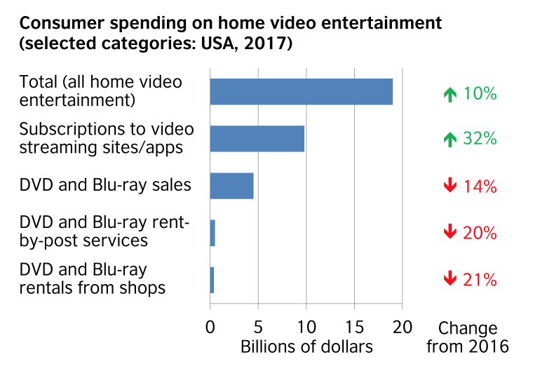
(Source: British Council (opens in a new tab))
Pie charts
-
Pie charts show how a whole is divided into different elements, such as total sales divided amongst different product types
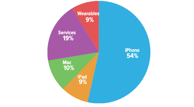
(Source: Six Colours (opens in a new tab))
Scatter graphs
-
Scatter graphs allow businesses to compare two variables, such as sales volume and advertising, to establish if there is any correlation between them
Infographics
-
Infographics are easy-to-understand visual representations of data

Correlation
-
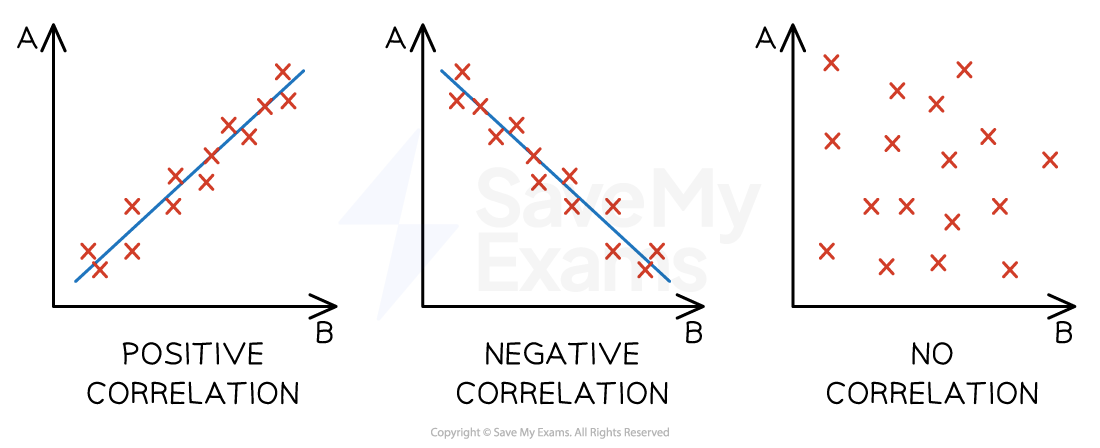
A correlation exists where there is a relationship or connection between two variables
-
A positive correlation means that as one variable increases, so does the other variable
-
A line of best fit that slopes upwards can be identified
-
-
A negative correlation means that as one variable increases, the other variable decreases
-
A line of best fit that slopes downwards can be identified
-
-
No correlation means that there is no connection between the two variables
-
It is not possible to identify a line of best fit
-
-
Diagrams of correlation types
-
Correlation does not always indicate a relationship or causation between two sets of variables
-
Businesses must conduct research to determine whether a relationship exists and the strength of that relationship
-
Examiner Tips and Tricks
When you forecast sales, use historic data to spot the trend, then project it forward — that’s extrapolation
Don’t confuse this with correlation, which only shows a link between two variables
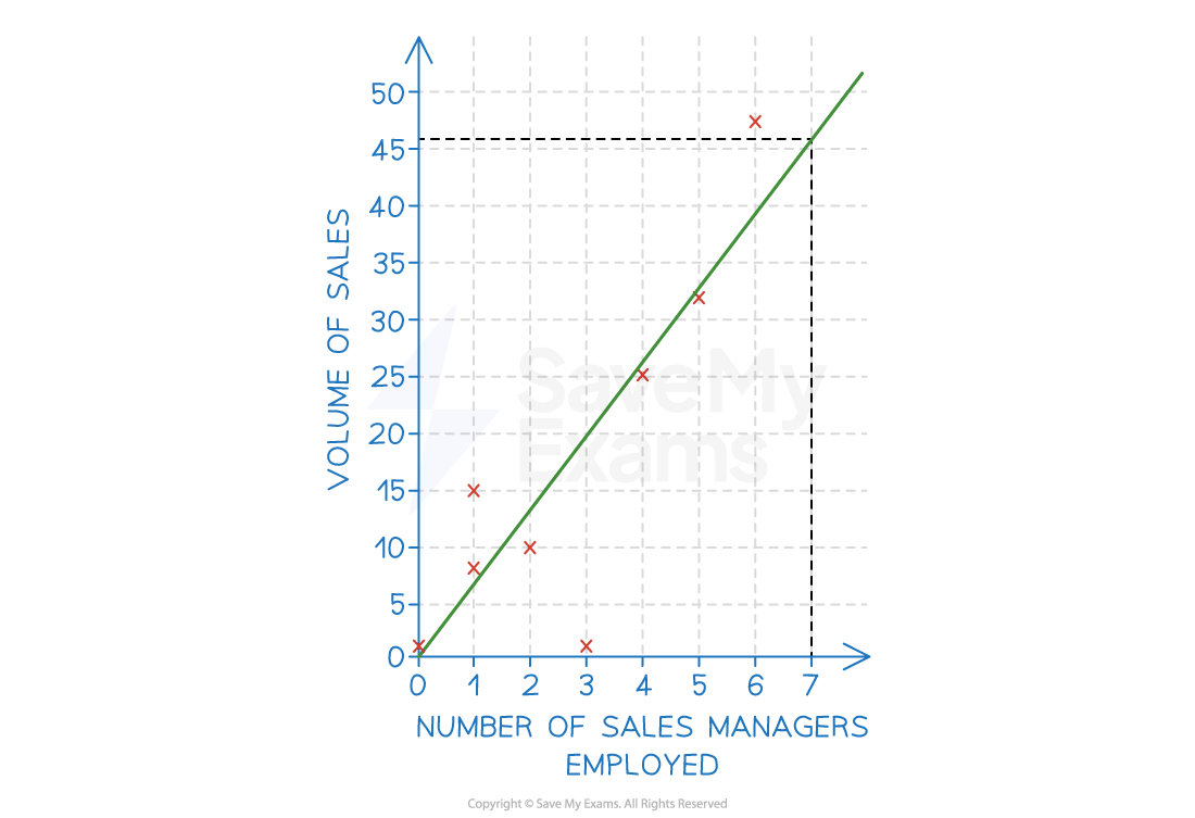
Extrapolation
-
Extrapolation is the assumption that what has happened in the past will be the same as what will happen in the future
-
Where a line of best fit can be identified and when causation is determined, a business can extrapolate data to make predictions around changes to either of the variables
-
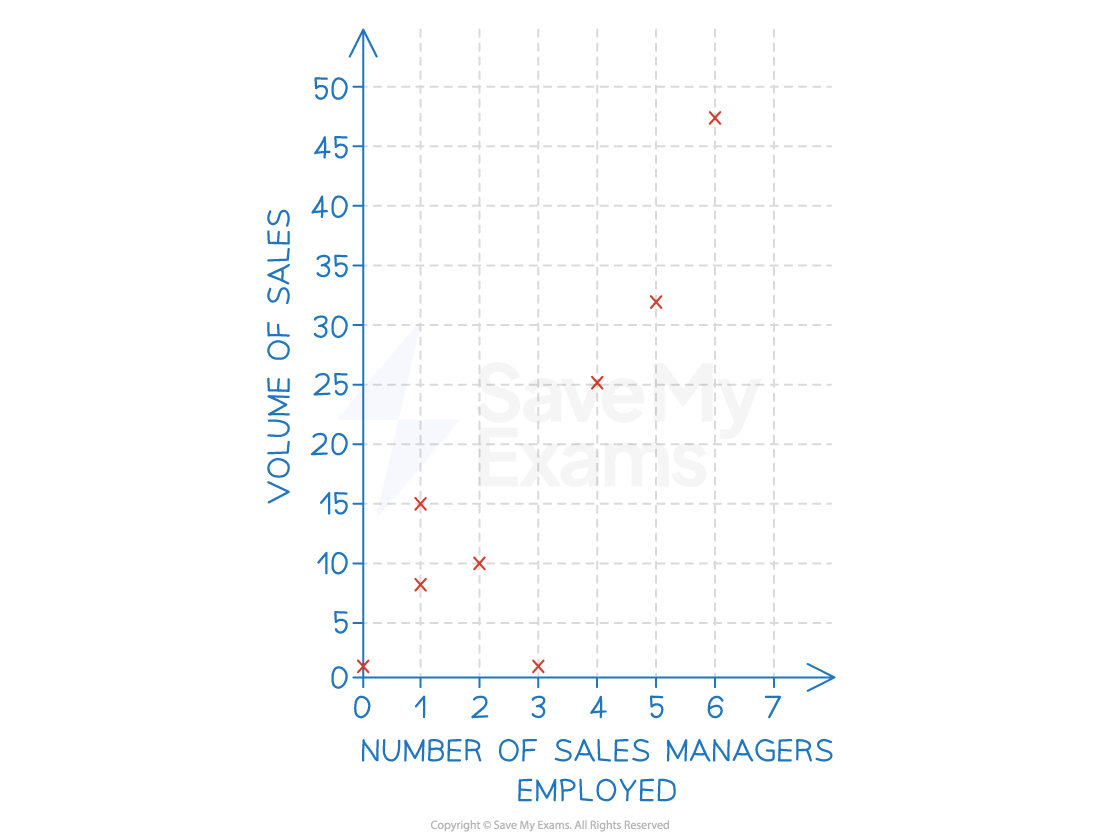
E.g. extrapolation of the line of best fit in the example below means that the business could predict that employing seven sales managers would likely result in sales of 46 units
-
Extrapolation using a line of best fit
Examiner Tips and Tricks
When drawing a line of best fit, you should try to include as many data points above the line as below the line
Watch out for outlying data — if there is more than one outlier above the line, adjust your line of best fit upwards
Similarly, if there is more than one outl
Responses